Roast.
The story:
Shared spaces aren’t known for their comfort—offices are too cold, apartment walls are too thin, your co-worker’s desk lunch is too smelly. In response to discomfort in their own office, KT Innovations developed Roast, a web-based comfort survey app that lets building owners, facility managers, HR professionals, and more make customizable surveys using pre-populated questions developed by building performance specialists.
My role:
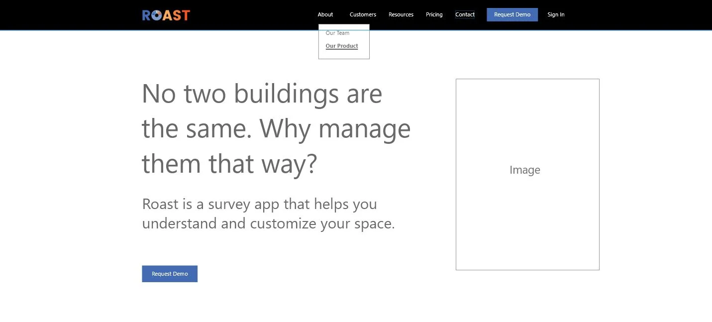
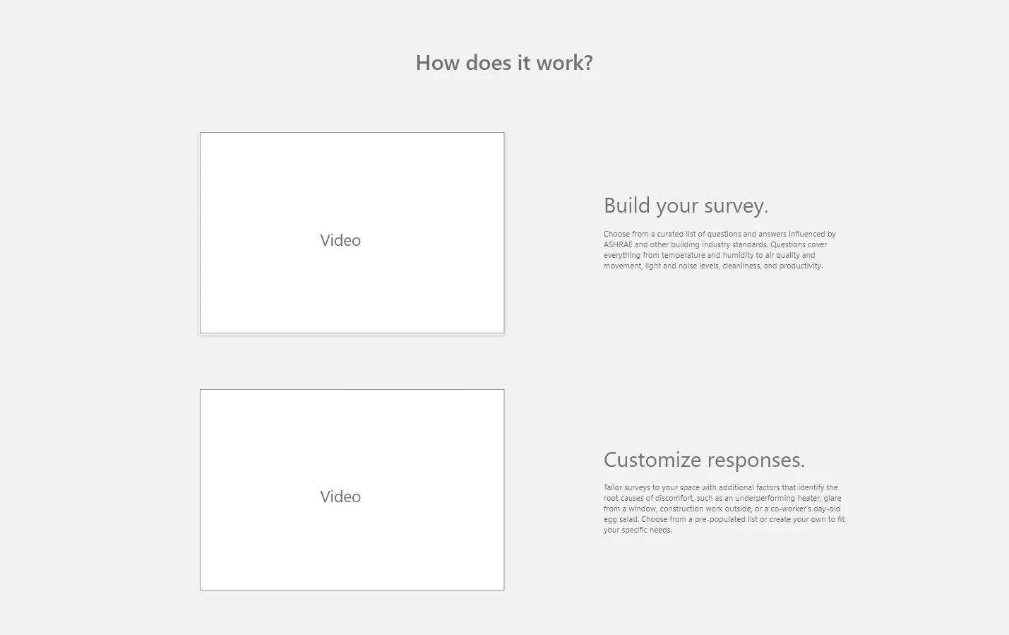
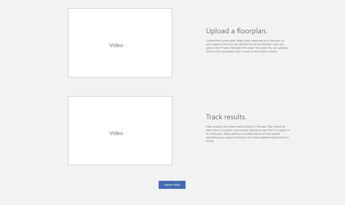
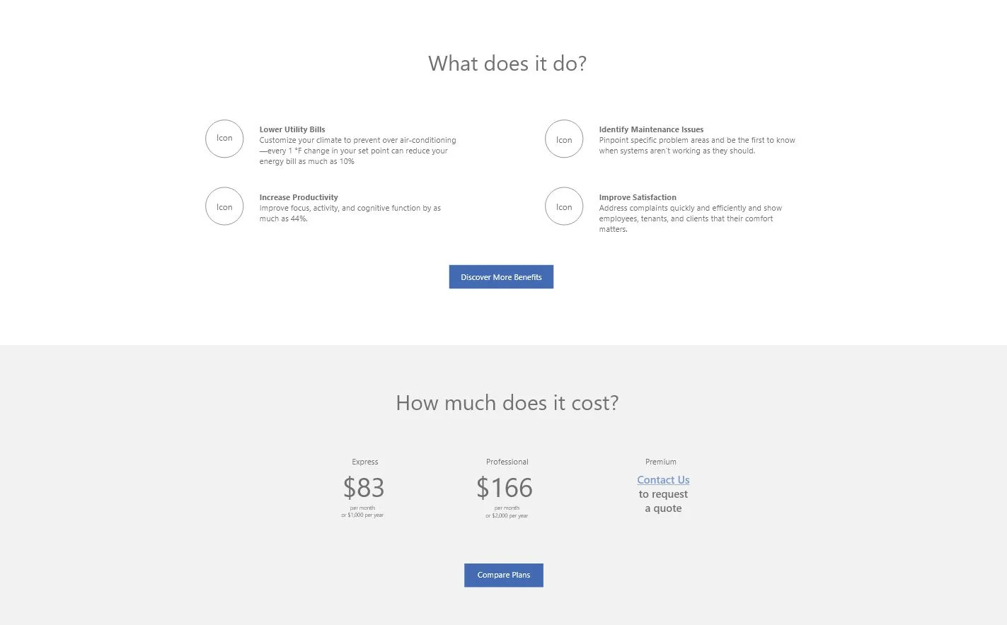
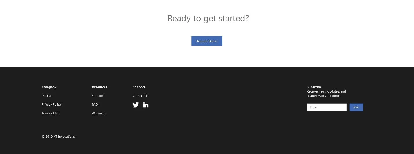
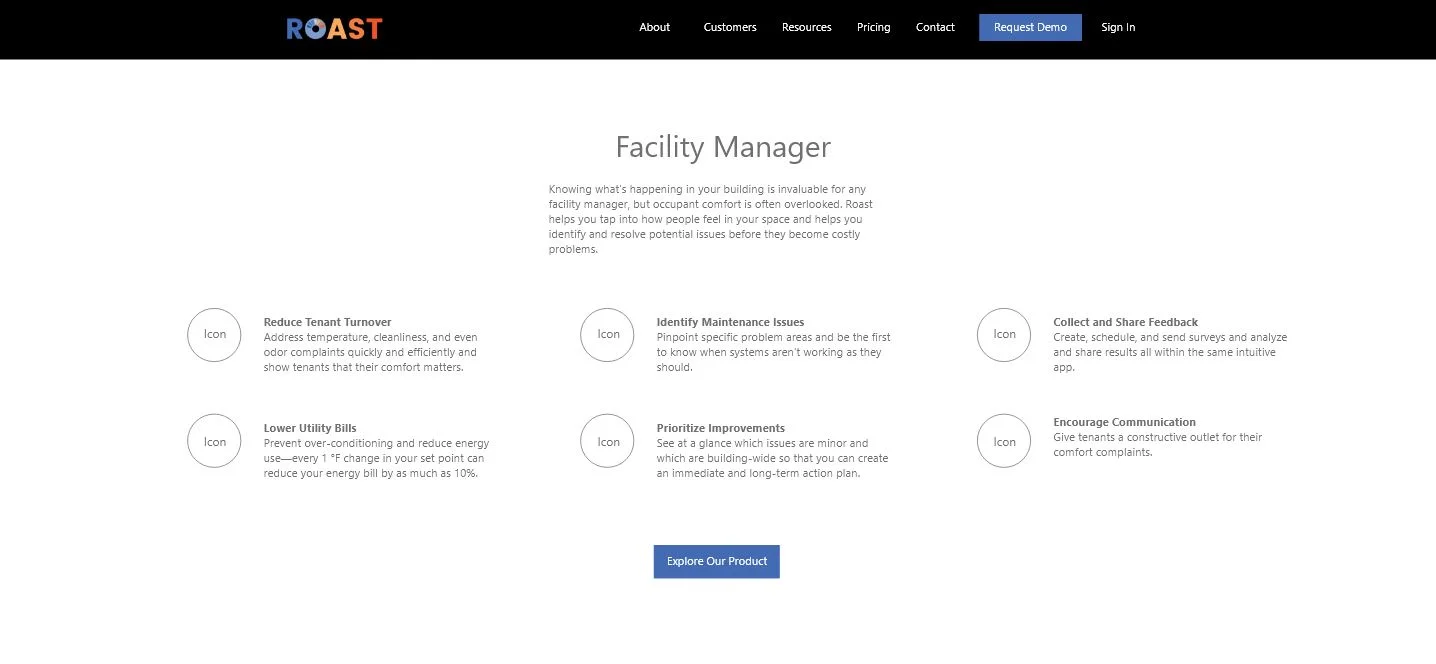
My work includes the support documentation and all in-app copy with the exception of the survey questions. I also collaborated with a UX designer to create the foundation for the next generation of the marketing website, which focuses on a more sales- and customer-driven experience.
The process:
The workflow for this project consisted of:
Meeting regularly with the project manager and development team to understand needs and goals
Conducting interviews and UX research with beta testers to understand challenges
Whiteboarding sketches and placeholder copy with a UX designer
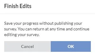
Writing copy for modals, toasters, buttons, instructions, and marketing content
Presenting copy in team reviews
Overseeing final implementation
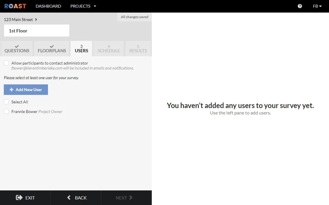
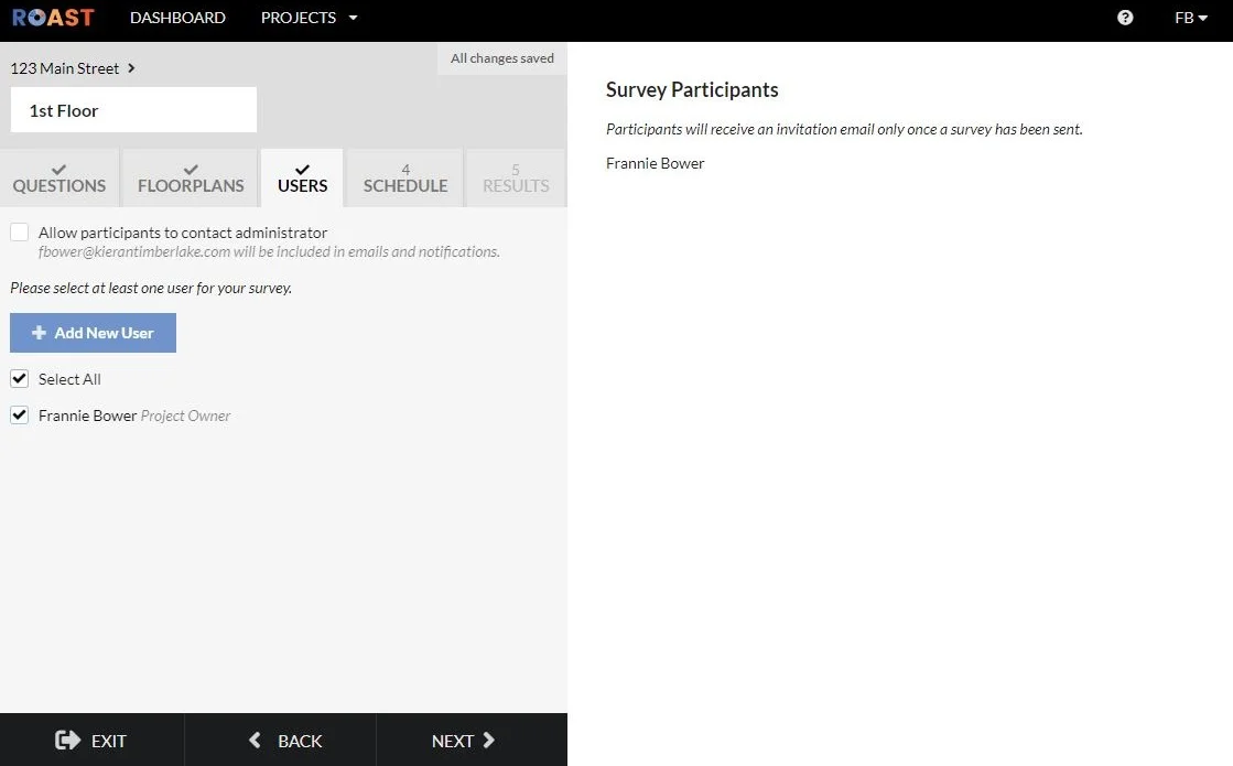
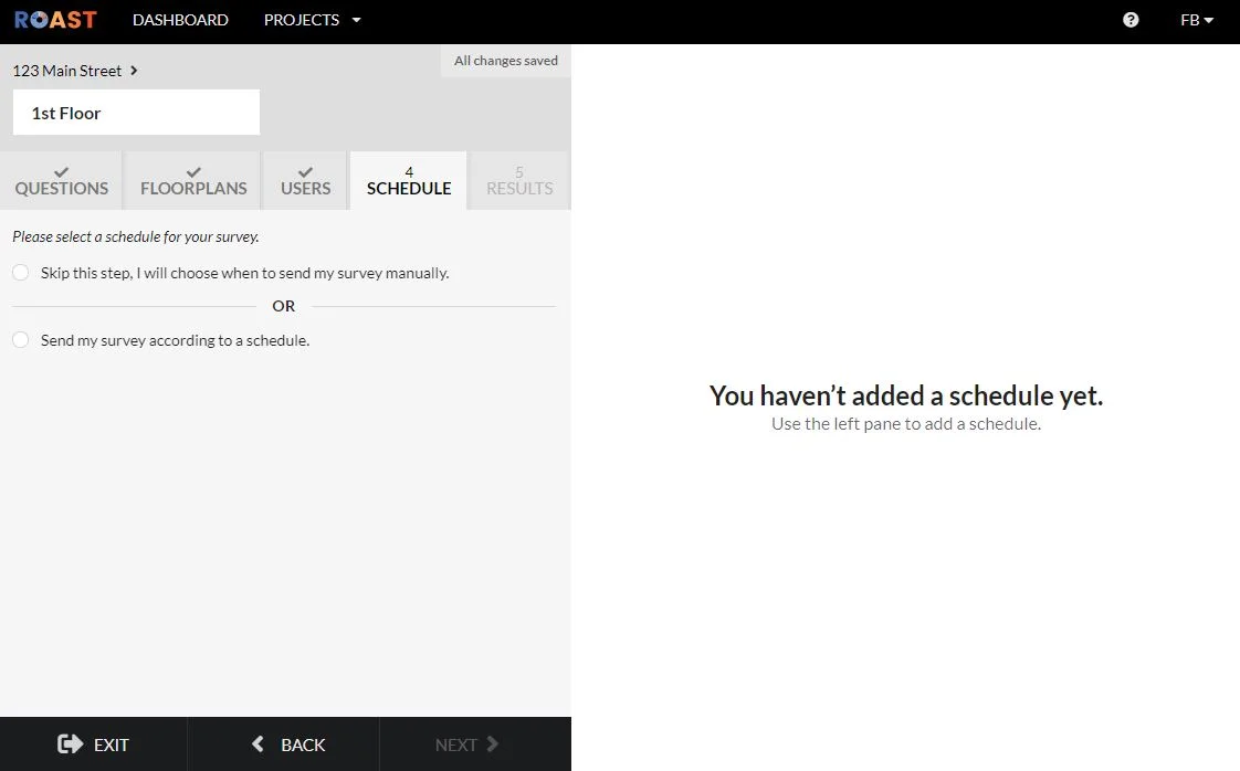
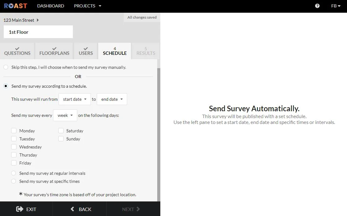
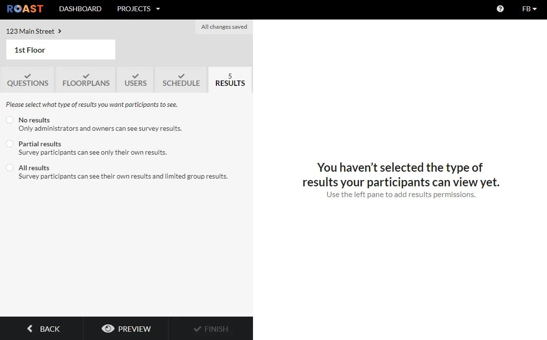
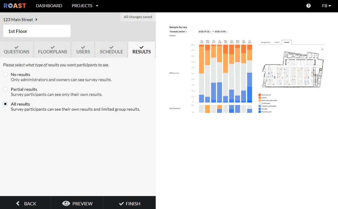
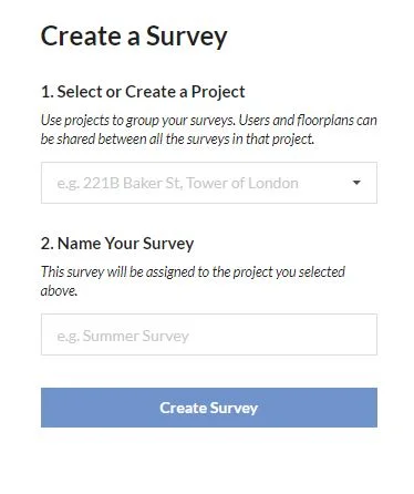
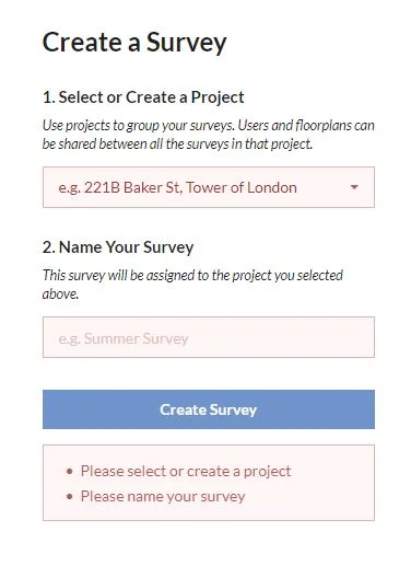
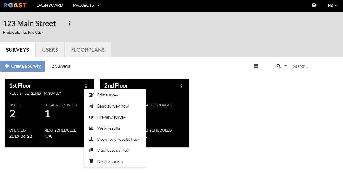
Creating a survey:
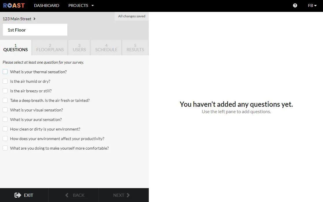
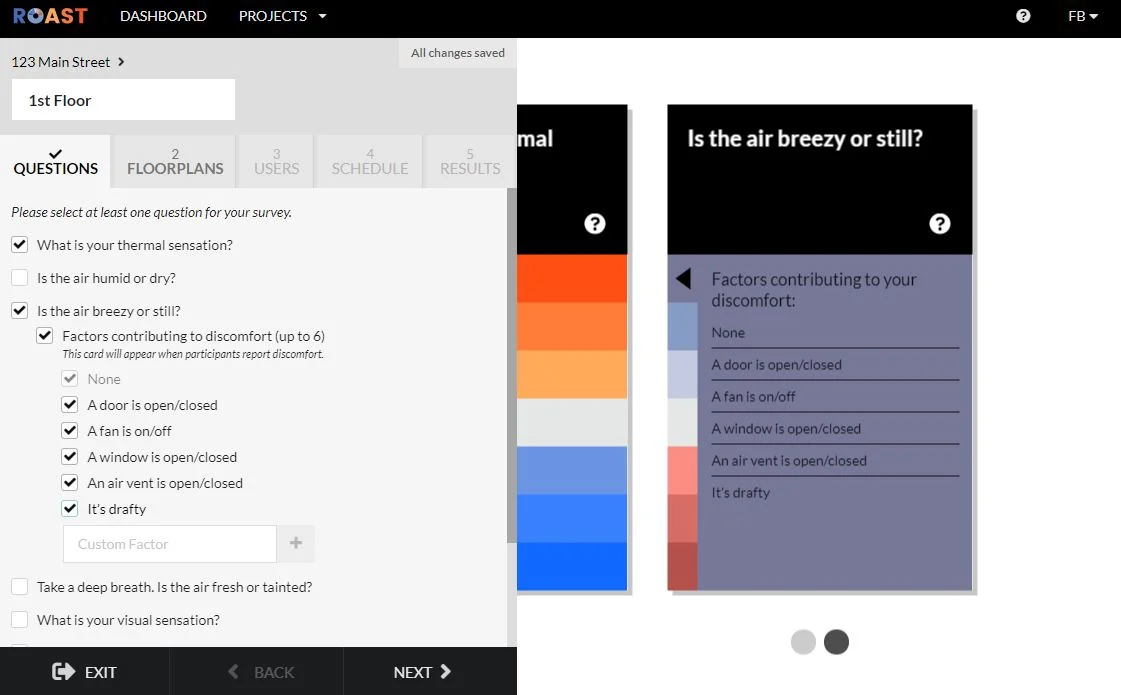
As the primary interaction in the app, the process of creating a survey needed to be clear, direct, and intuitive. Hiding opportunities for customization until an option is selected streamlines the user’s experience.
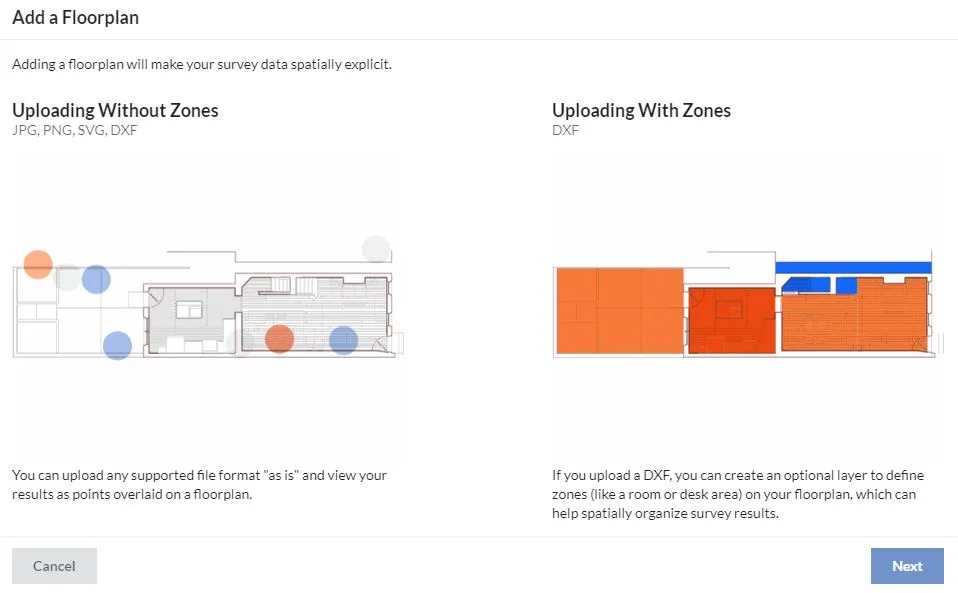
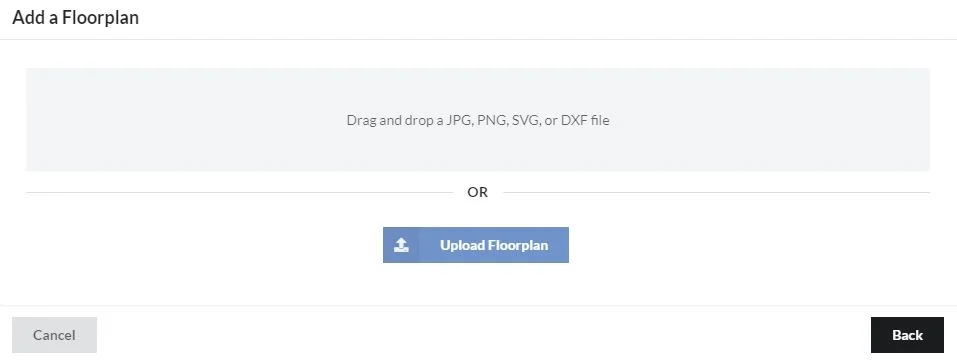
Adding a floorplan:
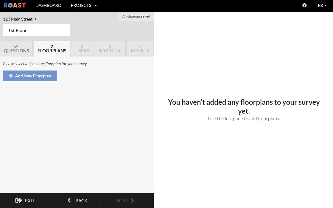
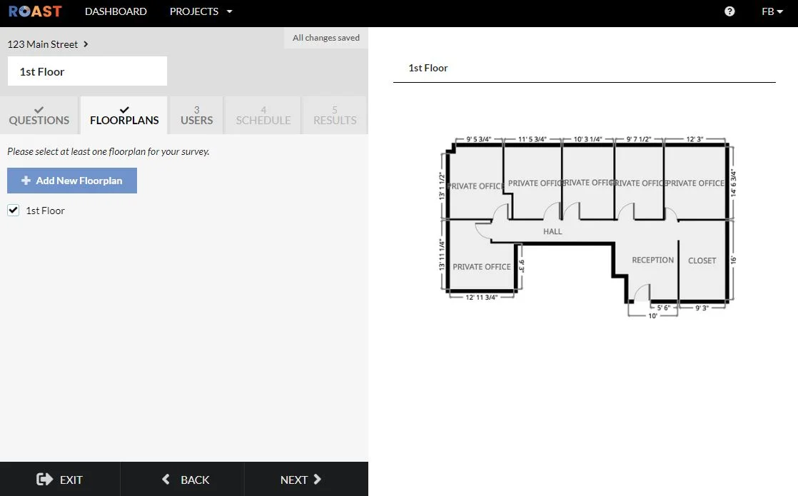
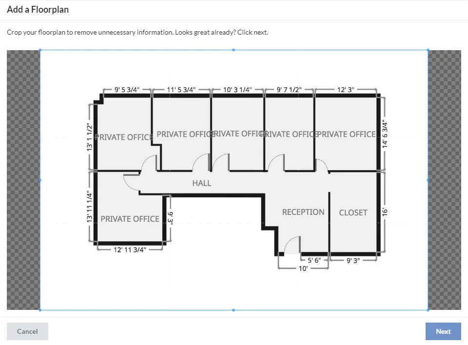
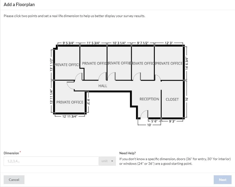
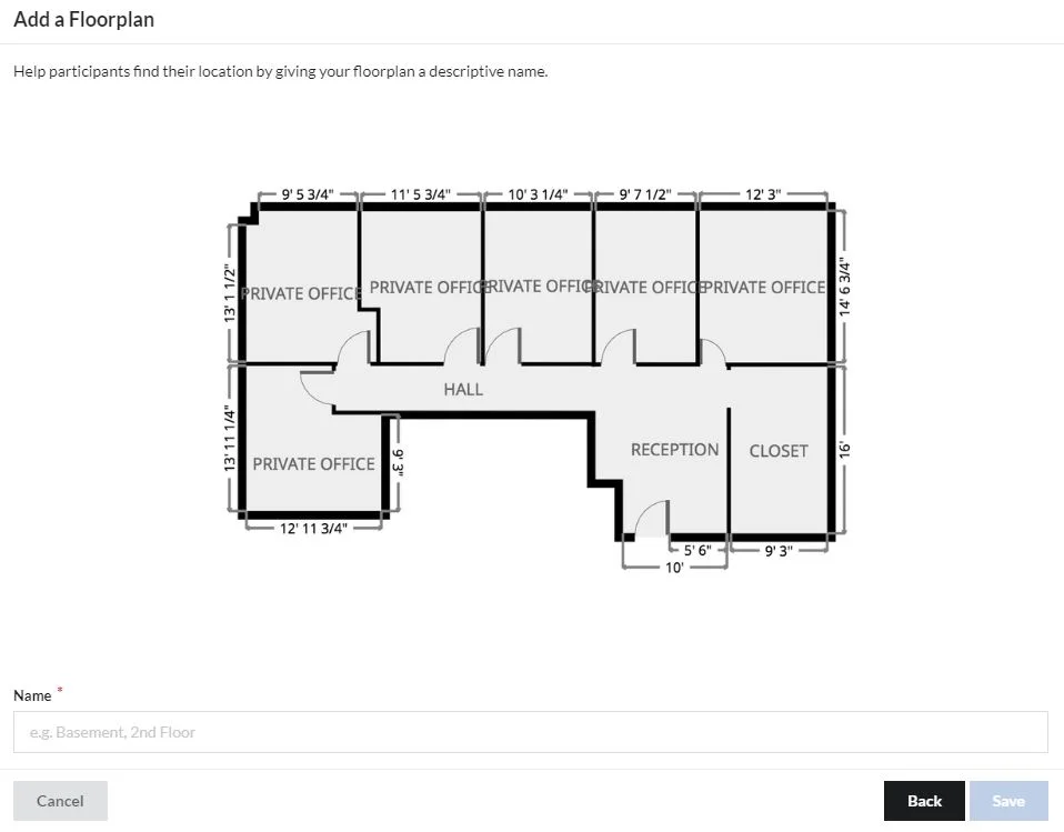
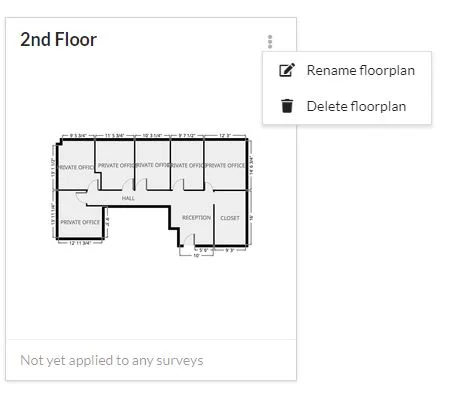
Adding a floorplan is one of the more complicated sequences in the app. I simplified the interaction by creating a multi-step modal that limits how much the user has to read at one time while still giving them the information they need.
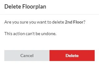
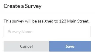
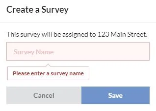
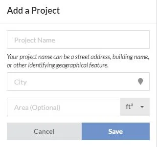
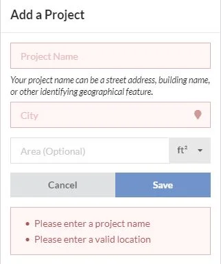
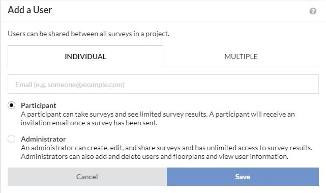
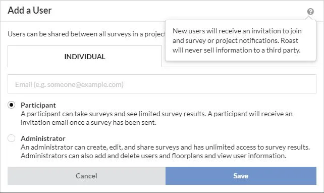
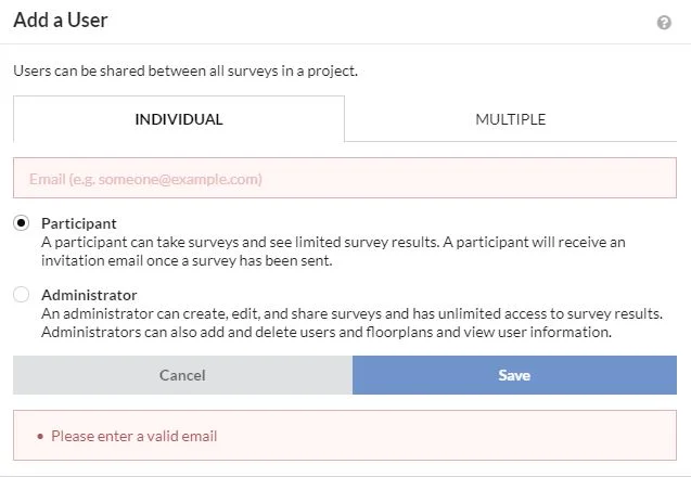
Modals, error messages, and tooltips:
A common challenge we encountered during beta testing was how to convey the difference between a project and a survey. While the development team initially requested an extensive “definitions” page, I guided the group towards brief definitions placed in the modals users encounter during on-boarding.
Home page:
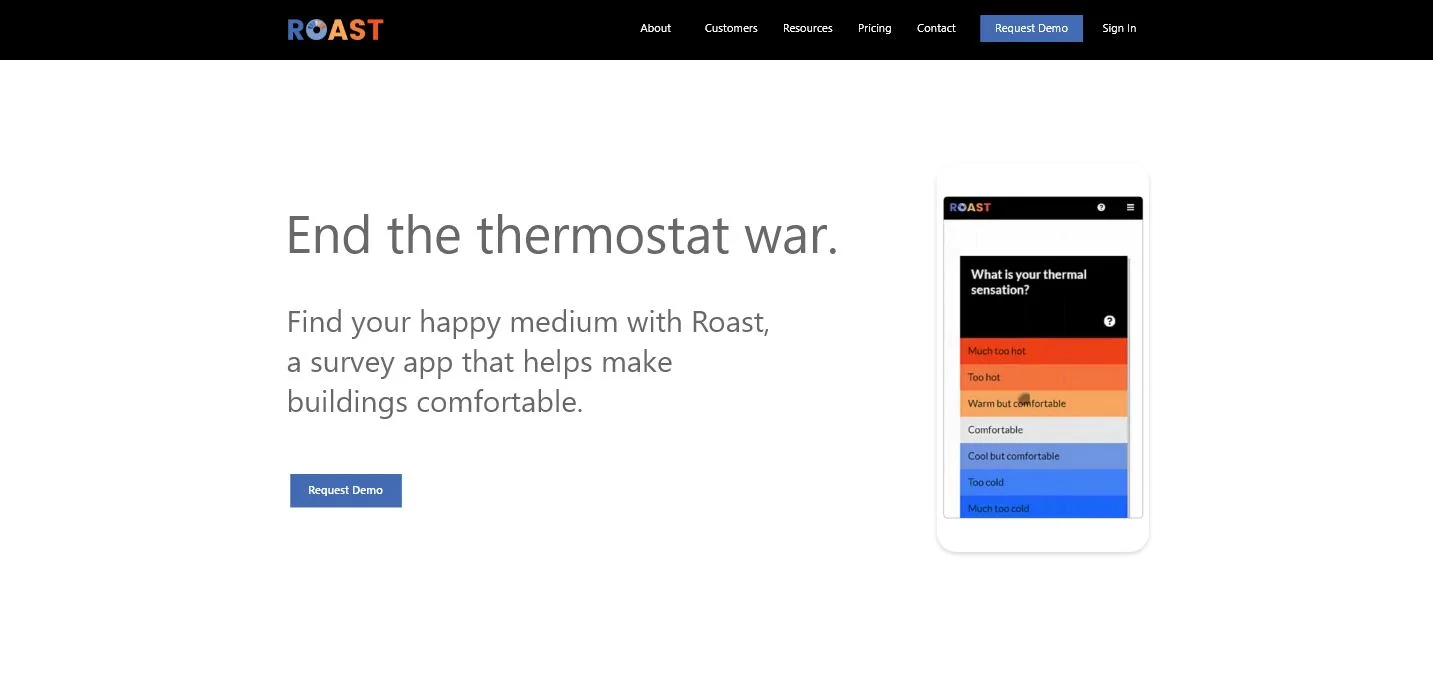
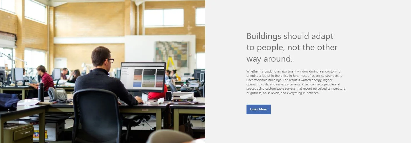
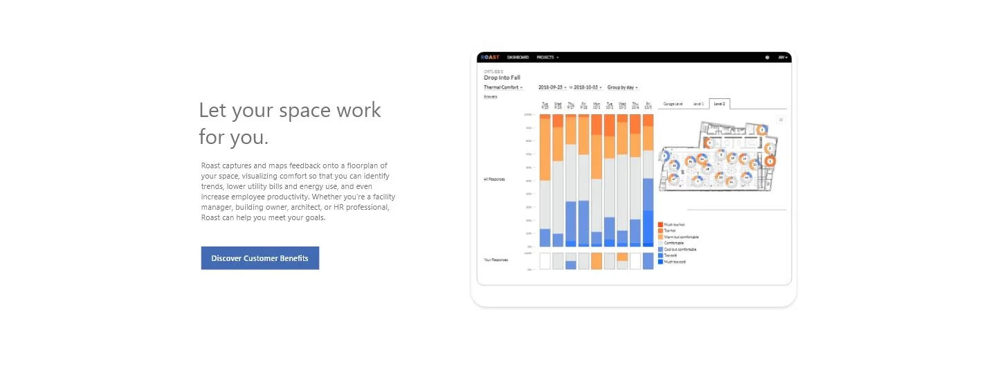
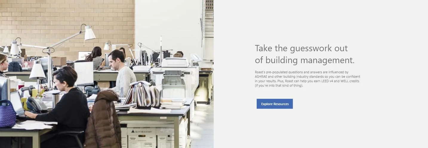
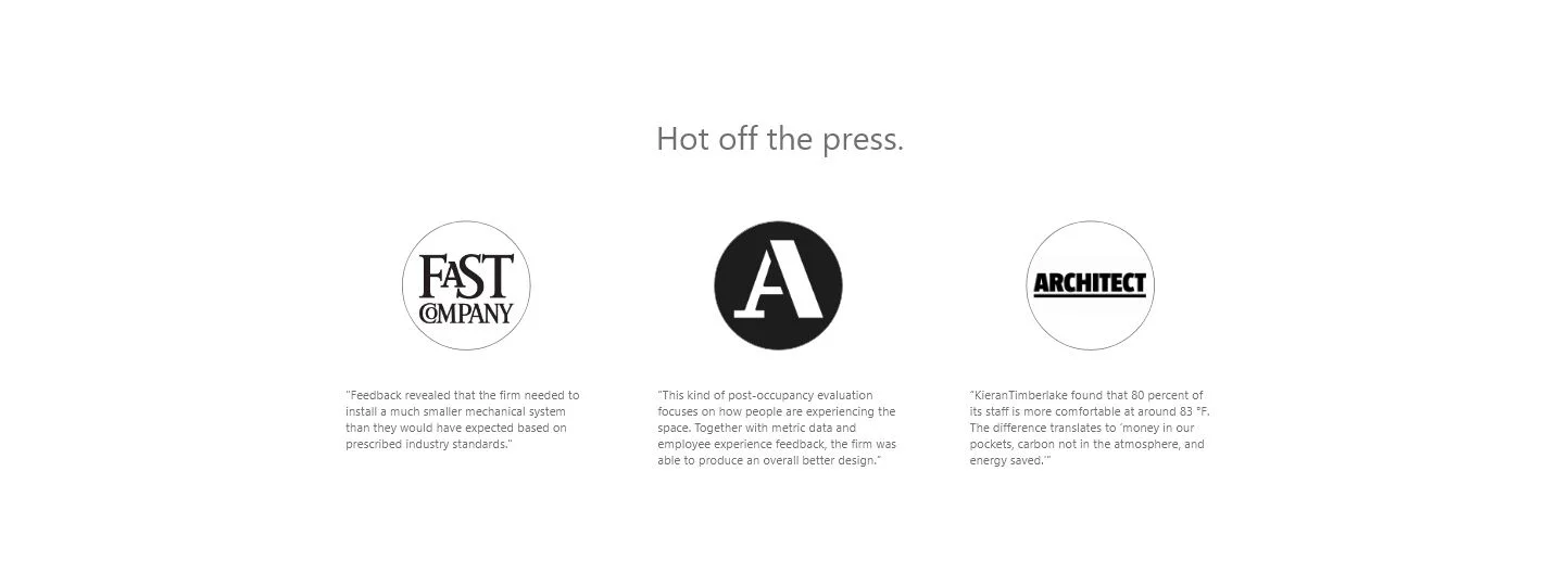
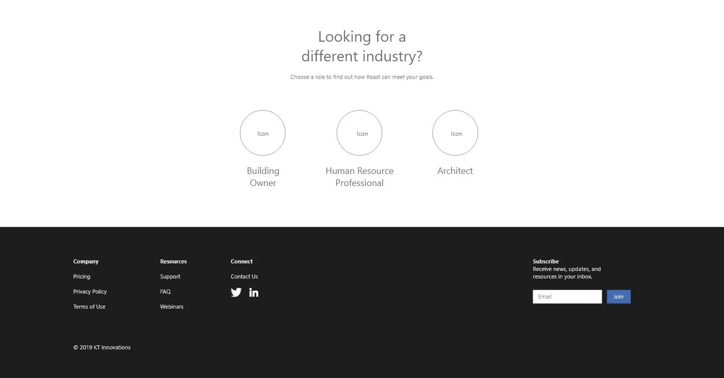
Roast was initially developed soley for architectural use, and the first generation website reflected that. In revamping the website, my focus was a friendlier, more relatable customer-driven experience that attracted a wider audience and generated leads.
